The Secret Golden Ratio for Museum-Grade Portrait Photomosaics: How to Turn 1,000 Family Memories into Living Wall Art
"Most of us have over 10,000 photos trapped inside our smartphones—birthdays, sunsets, candid laughs, quiet family dinners. We scroll past them, but they rarely get to live where we can feel them every day."
Transforming Trapped Digital Memories into Living Wall Art
When you look at a portrait of someone you love, your eyes immediately seek their expression—the gentle curve of a smile, the spark in their eyes, the familiar tilt of their head. But when that portrait is built from hundreds of your favorite shared memories, a magical duality happens: from across the room, you see their face; up close, you step into a visual timeline of your life together.
However, anyone who has tried making a photomosaic knows the classic dilemma: either the face is blurry, or the tiny photos are so heavily tinted with artificial color overlay that you can’t recognize the memories inside them.
To solve this once and for all, our studio generated and vision-tested a complete benchmark sweep across six parameter recipes. Below is the visual proof showing exactly how each overlay setting and tile size behaves.
⚡ Direct Answer: What Is the Optimal Recipe for a Portrait Photomosaic?
- Focus Overlay Area: Set strictly to
Foreground Subject Only(ensures background tiles stay 100% untouched). - Fidelity (Color Overlay): Exactly 35% on the subject (sharp facial contours without losing memory photo detail).
- Tile Size: 125px (~0.41" printed at 300 DPI) for standard 18×24" canvases; 100px for ultra-dense micro-detail.
- Anti-Clustering (Reuse Penalty): Set Penalty to 0.40 and Radius to 3 to prevent the same candid photo repeating across cheeks.
- Artistic Variety Mode: Enabled to maintain rich color variation in darker zones.
1. The Fidelity Benchmark: 0% vs 25% vs 35% vs 50%
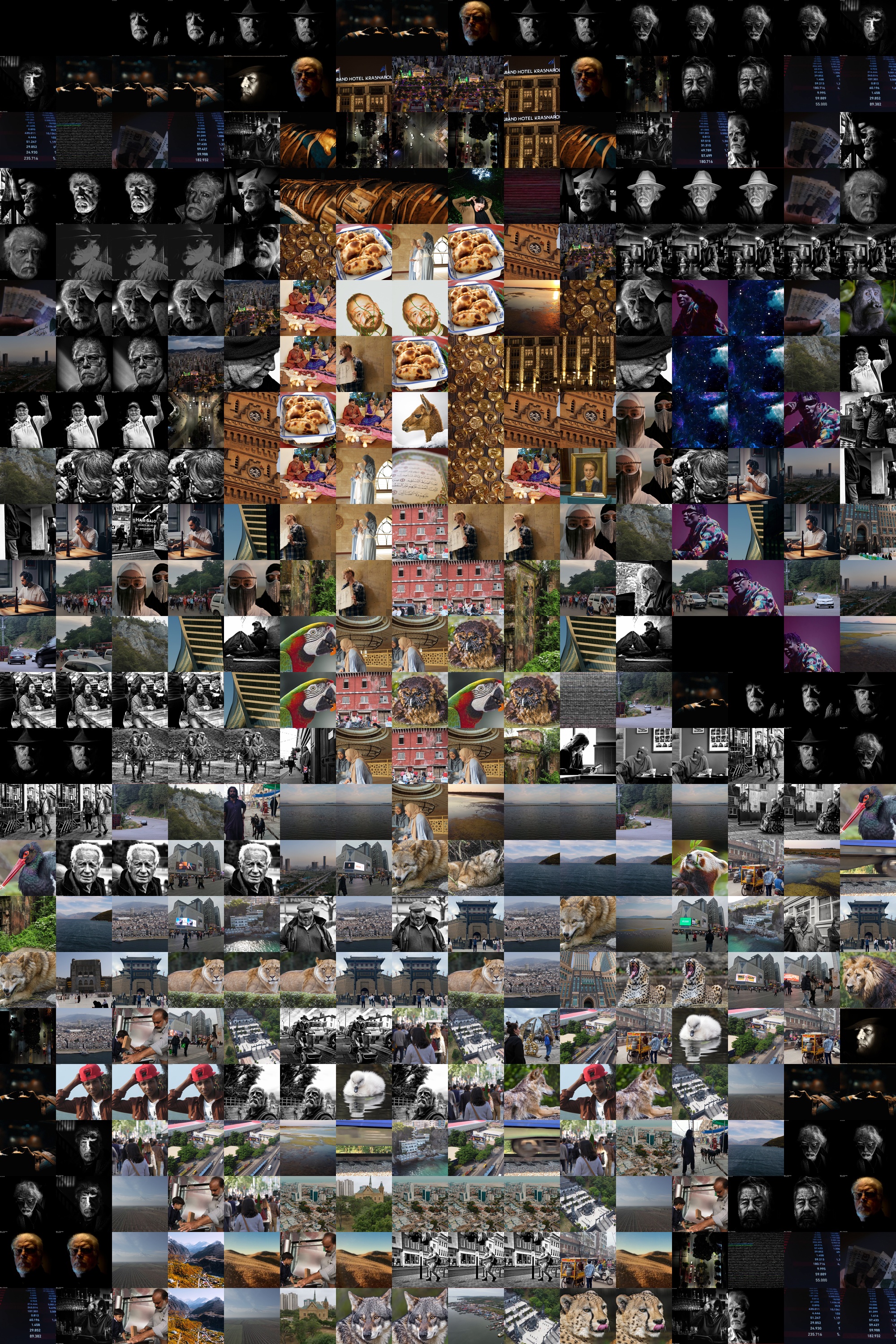
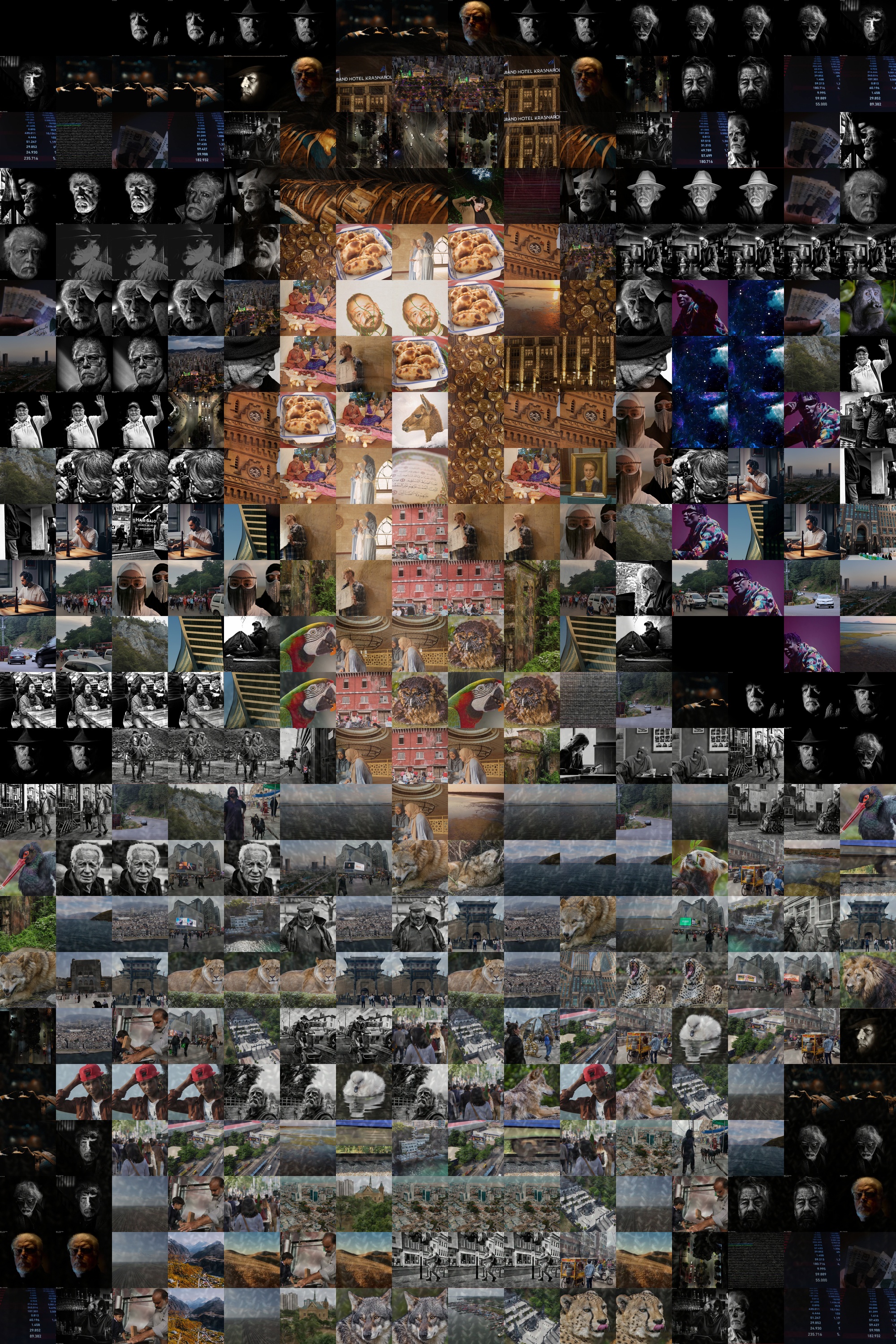
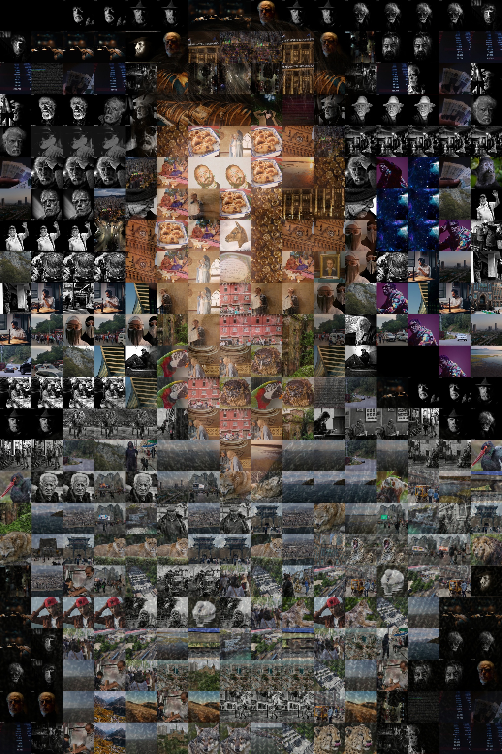
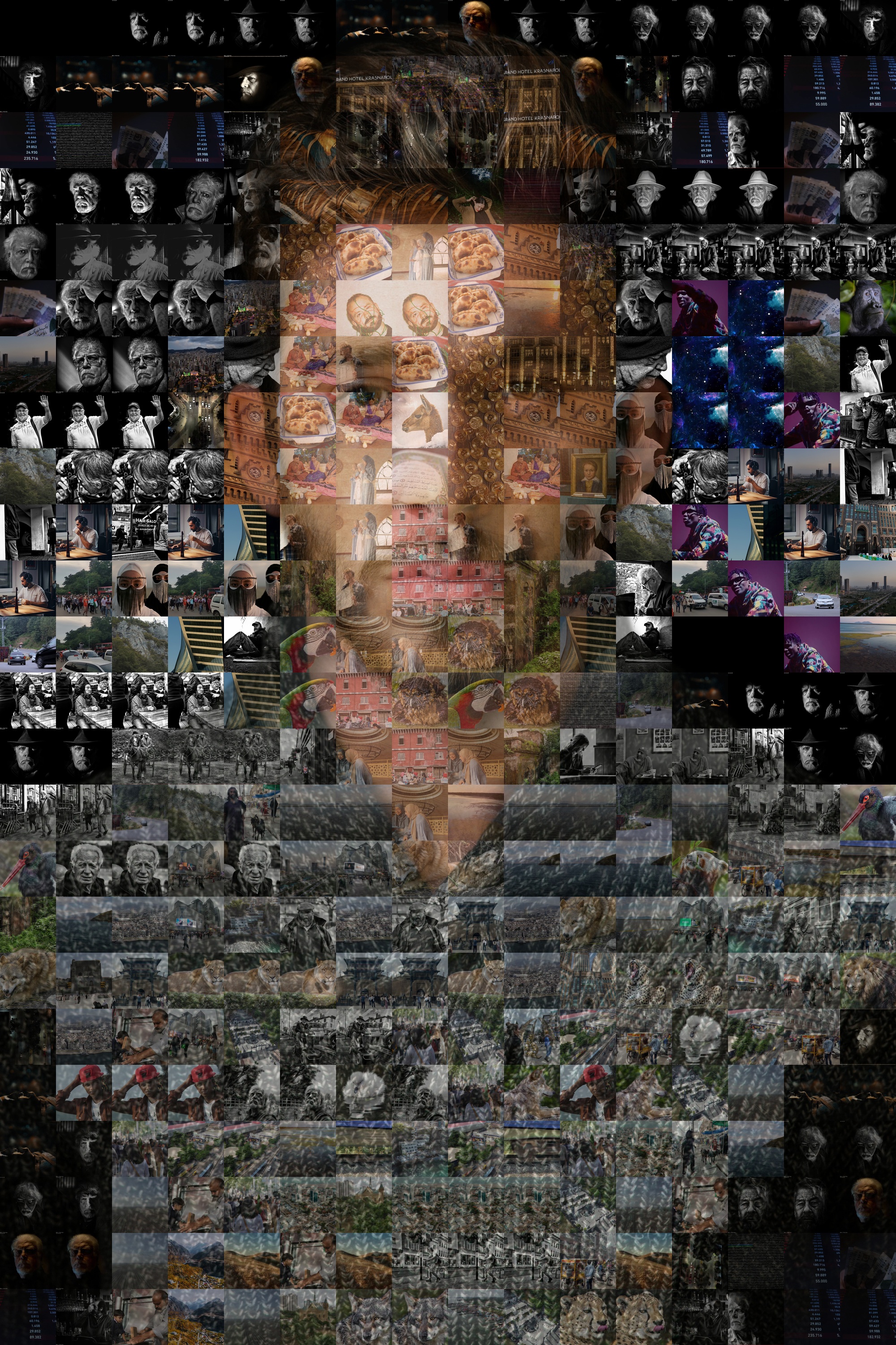
Here is the visual progression of four distinct overlay levels generated with 300 real memory tiles on an 18×24" poster canvas:
2. Macro Close-Up: The Anatomy of a Perfect Tile
Let’s zoom directly into the subject's face to see why 35% Foreground Overlay is the sweet spot:
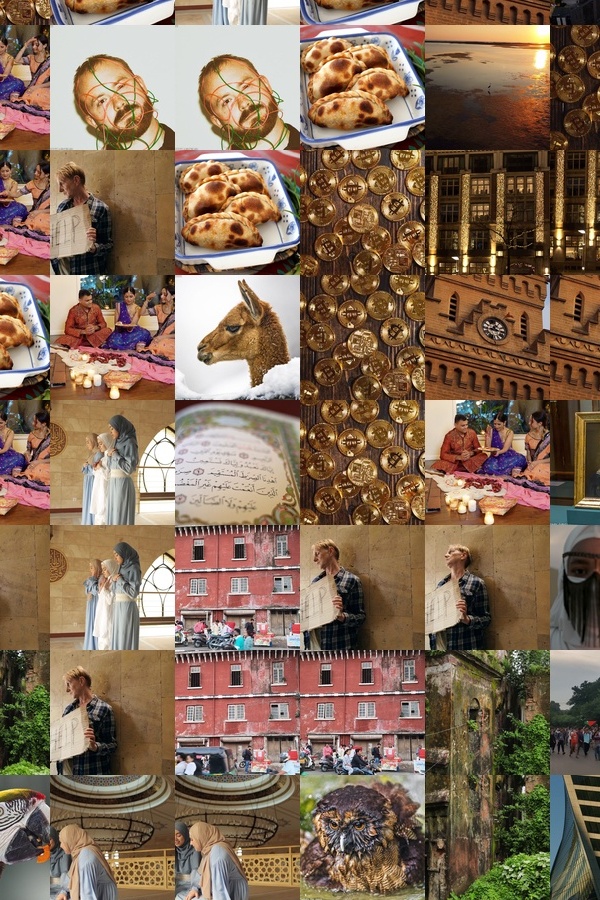
0% Overlay: Individual tiles are raw, but facial edges lack continuity.
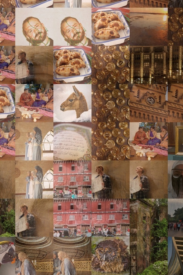
35% Overlay (Winner): Smooth skin gradients + 100% readable candid memories.
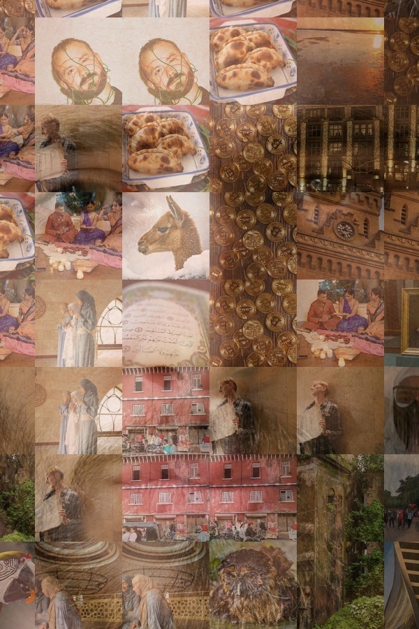
50% Overlay: High portrait sharpness, but tile photos begin to fade.
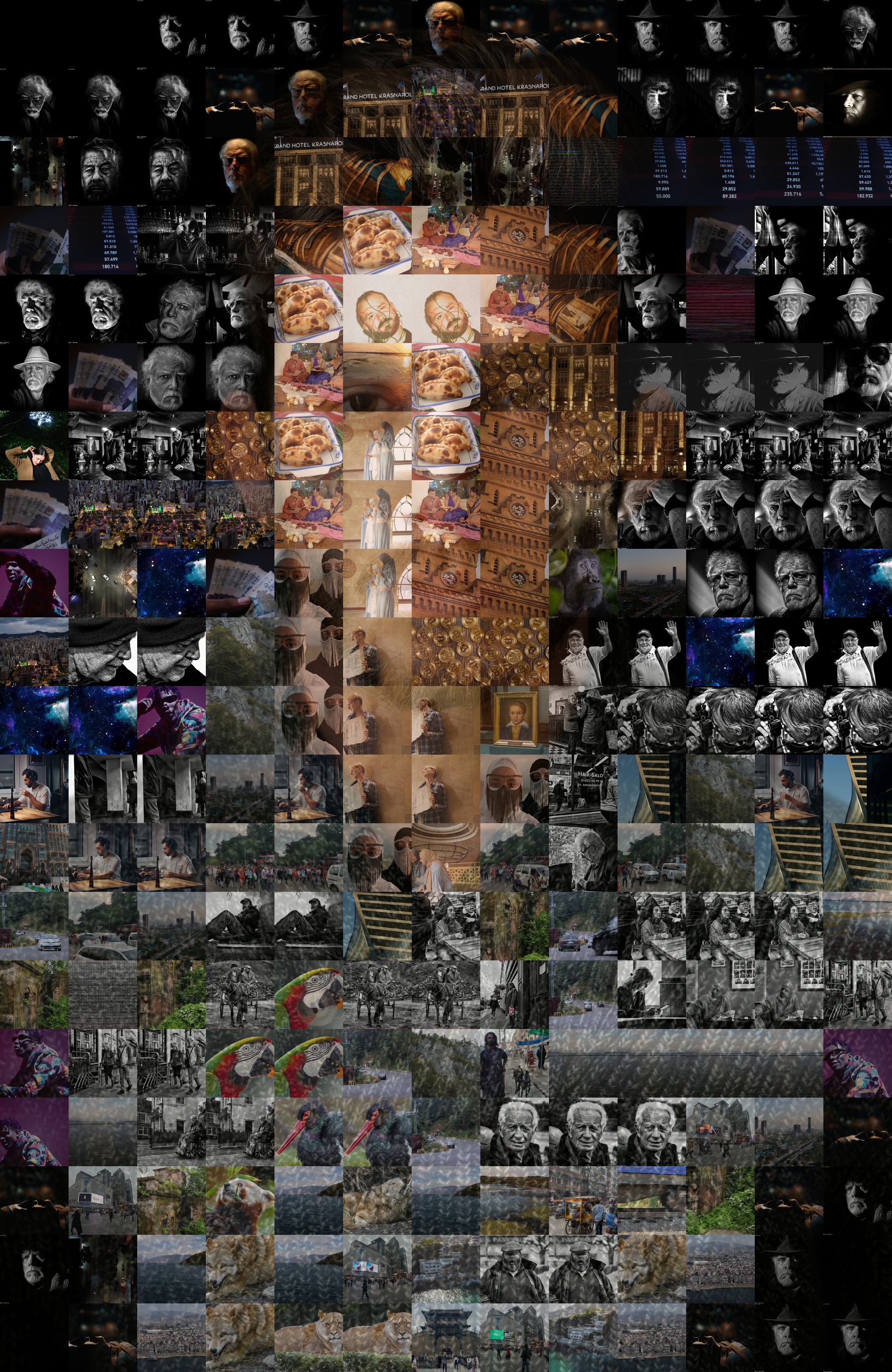
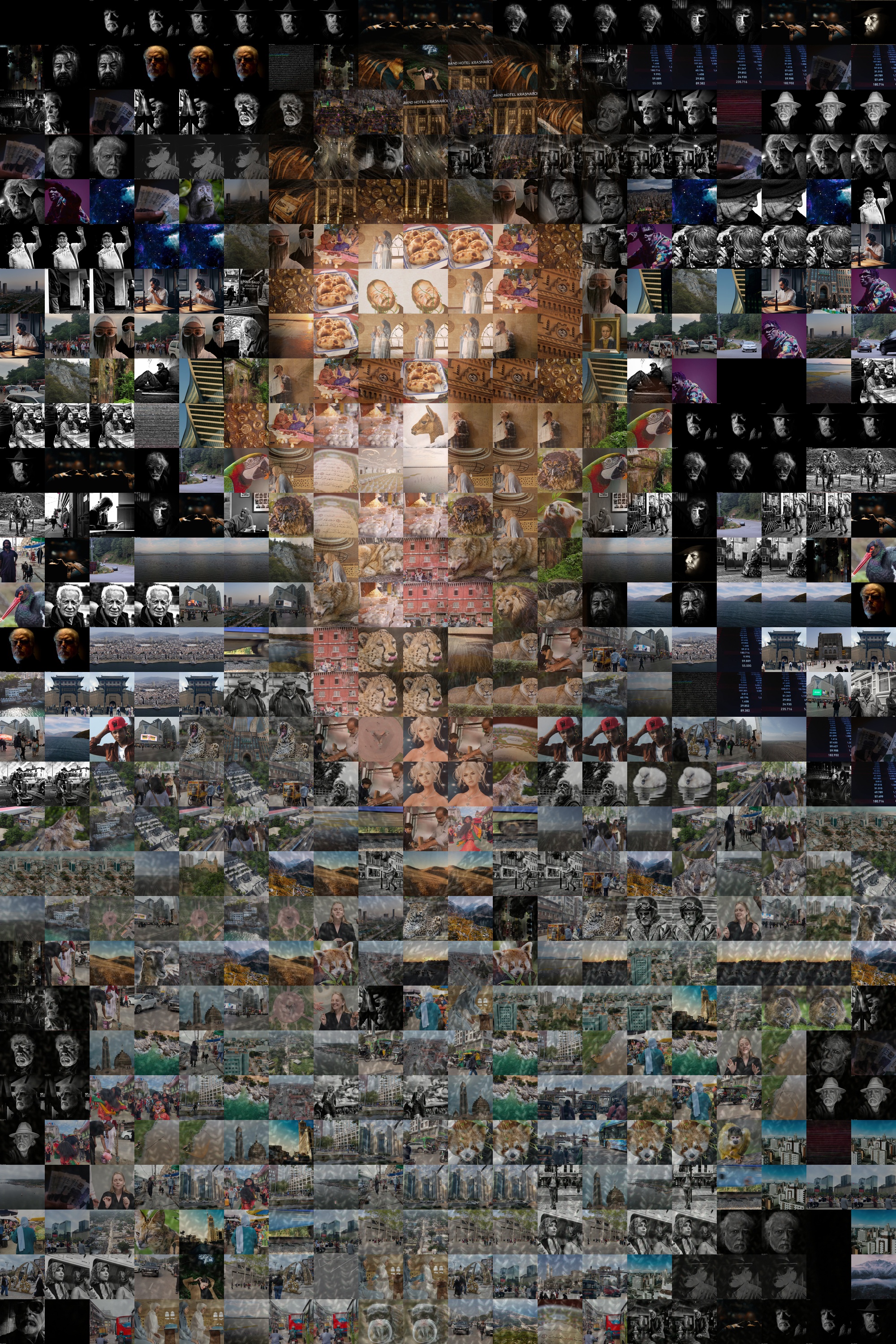
3. Tile Size Comparison: Macro Impact (150px) vs Micro-Detail (100px)
Depending on your room size and print dimensions, tile density creates completely different artistic experiences:
The 3 Non-Negotiable Rules for Portrait Photomosaics
1. Isolate Overlay to the Foreground Subject Only
Never apply a flat color tint across the entire canvas. By keeping the background at 0% overlay, the outer frame remains an authentic, vibrant gallery of your travels and family moments.
2. Enforce the 3-Tile Anti-Clustering Rule
Because facial skin tones have similar color values, algorithms can easily place the exact same photo 10 times across a single cheek. Setting a Reuse Penalty of 0.40 with a Radius of 3 forces the mosaic engine to spread duplicate memories at least 3 tiles apart.
3. Print at True 300 DPI
A web preview on a phone screen can hide flaws. For physical wall art, always ensure your output is rendered at 300 DPI (such as $7200 imes5400 ext{px}$ for an 18×24" poster) so every tiny smile prints razor-sharp.
Turn Your Photo Library into a Living Centerpiece
Upload your favorite portrait, add your camera roll, and let our studio-grade mosaic engine assemble your family heirloom in seconds.
Create Your Custom Mosaic at Photomosaic.work →

Comments
Post a Comment